
31 de mayo de 2010
26 de mayo de 2010

20 de mayo de 2010

19 de mayo de 2010

17 de mayo de 2010

11 de mayo de 2010


7 de mayo de 2010
21 de abril de 2010
19 de abril de 2010
9 de abril de 2010

8 de abril de 2010

5 de abril de 2010
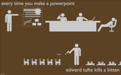
Edward Tufte en la Casa Blanca
Una entrevista de seis minutos:
Edward Tufte is perhaps the country's foremost evangelist for the clean, clear and rich presentation of complex information. The Obama administration's stimulus package is flooding the economy with 787 billion dollars for employment and public works projects. Put the two together, as Obama did earlier this month when he nominated Tufte for the stimulus advisory board with the hopes that the public will have a fighting chance of understanding where the stimulus money went and what it's doing.
30 de marzo de 2010

26 de marzo de 2010

23 de marzo de 2010

22 de marzo de 2010
17 de marzo de 2010
Spam
via: Data Mining

An interesting and direct infographic from New Scientist reports that spam emails have something like a 0.000008% conversion rate. Seems small, but a single botnet produced $3.5 million dollars worth of sales.
[Original article is here]
16 de marzo de 2010
14 de marzo de 2010

13 de marzo de 2010
12 de marzo de 2010
Comentar infografías
Vis Lab lanzó un espacio en el cual subirán infografías "clásicas" (según ellos) para que los usuarios que se registren comenten. Puede ser interesante, o no.
We've launched an alpha version of our collaborative visualization tool CommentSpace. Using CommentSpace, you can comment on and collaborate around classic visualizations like the US Census Job Voyager as well as new visualizations of data from the recently-concluded 2010 Olympic Games. Come explore the visualizations start commenting!
11 de marzo de 2010

Cómo alimentar el mundo?
Otra video-infografía, tan de moda actualmente, pero no me terminan de convencer...
How to feed the world ? from Denis van Waerebeke on Vimeo.
Suscribirse a:
Entradas (Atom)

